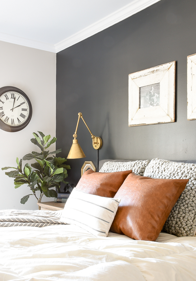
Unlocking Design with Gray Color Contrasts

Ever wonder how some websites just seem to *work*? They're easy on the eyes, the information is clear, and the overall aesthetic is pleasing. Often, the magic lies in the subtle art of color contrast, particularly with shades of gray. Gray might seem boring, but it's a design workhorse, providing a neutral backdrop that lets other colors shine. Mastering its contrasts is key to creating visually compelling and accessible designs.
Gray's neutrality offers a vast spectrum of design possibilities. From the palest whispers to deep charcoal tones, gray's versatility allows for a wide range of color pairings. Understanding these pairings and the interplay between light and dark grays is crucial for establishing hierarchy, guiding the user's eye, and conveying specific moods and emotions in your design.
While the specific "origin" of using gray in design isn't easily pinpointed, its use has evolved alongside the development of visual communication. Early printing relied heavily on black and white, with gray emerging as a natural intermediary. As color printing and digital design became more sophisticated, gray retained its importance, evolving from a limitation to a powerful design tool. Its importance stems from its ability to create balance, enhance readability, and provide a timeless, sophisticated aesthetic.
A major issue related to using gray in design is achieving sufficient contrast, especially concerning accessibility. WCAG (Web Content Accessibility Guidelines) emphasizes the importance of adequate color contrast between text and background for users with visual impairments. Using light gray text on a slightly darker gray background, for instance, can make content difficult to read for many people. Careful consideration of contrast ratios is crucial for inclusive design.
Color contrast refers to the difference in luminance or brightness between two colors. With gray, this involves selecting shades that differ sufficiently in their lightness or darkness to create visual separation and readability. A simple example is using dark gray text on a light gray background, or vice-versa. The greater the difference in luminance, the higher the contrast and the easier it is to distinguish the elements.
One benefit of using gray is its versatility. It works well with virtually any color, allowing you to create a variety of moods and aesthetics. For example, pairing gray with bright accents can create a modern, energetic feel, while combining it with muted tones results in a more calming, sophisticated look.
Gray also promotes readability. A light gray background paired with dark gray text provides excellent contrast, making the content easy to read and digest. This is crucial for websites, applications, and any design where information consumption is key.
Finally, gray conveys a sense of professionalism and timelessness. It's a neutral, balanced color that doesn't go out of style. This makes it ideal for corporate branding, minimalist designs, and projects that aim for a sophisticated, enduring aesthetic.
To effectively use gray in design, start by choosing a primary gray shade. Then, select lighter and darker variations to create contrast and hierarchy. Test different combinations to ensure adequate contrast ratios, particularly for text and background elements. Experiment with various color palettes and see how they interact with your chosen grays.
Advantages and Disadvantages of Color Contrast with Gray
| Advantages | Disadvantages |
|---|---|
| Versatility | Can appear dull if not used effectively |
| Enhances readability | Difficult to achieve sufficient contrast with some color combinations |
| Timeless and professional aesthetic | Can create a cold or impersonal feel if overused |
Frequently Asked Questions:
Q: What is color contrast with gray? A: It's the difference in lightness/darkness between gray shades or gray and other colors.
Q: Why is color contrast important? A: For readability and accessibility.
Q: How do I check color contrast? A: Use online contrast checkers.
Q: What are some good gray color combinations? A: Gray with blues, greens, yellows, or reds.
Q: How can I make gray more interesting? A: Use textures, patterns, or pair it with vibrant accent colors.
Q: Is gray a good choice for web design? A: Yes, it’s versatile and professional.
Q: How can I avoid making my design look dull with gray? A: Use a variety of gray shades and combine them with other colors.
Q: What's the best gray for body text? A: Dark gray on a light background or vice versa for good contrast.
In conclusion, the subtle power of color contrast with gray should not be underestimated. From enhancing readability to conveying a timeless aesthetic, mastering the interplay of gray shades unlocks a world of design possibilities. By understanding the principles of contrast, considering accessibility guidelines, and exploring various gray combinations, you can create visually stunning and user-friendly designs. Whether you're crafting a website, designing a logo, or creating any visual content, incorporating the versatility and sophistication of gray color contrasts can elevate your work to a new level of professionalism and visual appeal. So, embrace the power of gray and unlock its potential in your next design project.
Decoding benjamin moores hottest hues
Decoding the enigma what is falling in love
Printable bird templates unleash your creativity


